Andreas Zeller

Andreas Zeller is faculty at the CISPA Helmholtz Center for Information Security and professor for Software Engineering at Saarland University. His research on testing and analyzing software has proven highly influential. Zeller is an ACM Fellow, an IEEE Fellow, an IFIP Fellow, holds an ACM SIGSOFT Outstanding Research Award and an IEEE Harlan D. Mills Award.
Mail: andreas.zeller@cispa.de
Phone: +49 681 87083-1001
Bluesky: @andreaszeller.bsky.social
Mastodon: @AndreasZeller@mastodon.social
Linkedin: andreaszeller
GitHub: andreas-zeller
Hosted on GitHub Pages — Theme by orderedlist
Summarizing your presentation with miniature slides
by Andreas Zeller
The slide that drives me nuts
As part of my job, I listen to talks a lot. There's good talks, and there's bad talks. But nothing can drive me as crazy as making a slide like this your final slide:What's wrong with showing "Thank you!" at the end? Or "Questions?"? Or both? The problem is that most talks are followed by a discussion. With a slide like this showing up at the end, there's three problems:
- Parts of your audience will have lost contact during your talk, and wake up for the final slide only. With this showing up, they won't get the message.
- The idea of the discussion is to get valuable feedback. But to ask questions, your audience will have to get the technical terms right. If they don't remember the exact name of your technique, they won't ask questions for fear of embarrassment.
- If the discussion goes for five minutes, this is the single slide that shows up for the longest time. This is such a missed opportunity for delivering your message!
The bullet summary style
A much better alternative is to simply say "Thank you" and to use the screen space for summarizing your talk. In standard bullet style, the slide would look something like this:
Your audience can now use the slide to ask questions ("Your... errr... Bumblebee technique: If it is better for amblefuns, wouldn't it be worse for fumbleduns?"); people who have slept throughout your talk still get the message; and anyone who finds the discussion too special have all the time to enter the URL into the browser of choice to learn more about the project. Much better already.
Summarizing with miniature slides
The "bullet style" summary still has issues, though. Many talks have diagrams that summarize processes or results. These won't show up on a bullet style slide, and as these invariably attract the most questions ("Why is it that this column is so high?"), you frequently have to switch back to earlier slides, which (a) takes time and (b) again takes the summary of your talk away from the audience.
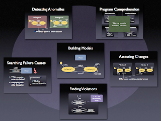
Here's my solution for the last slide. Take the four most important slides of your talk (say: problem, process, results, and discussion), and paste them together on one single slide. The result looks like this:
All these are slides that were shown earlier during the talk; hence, I can make it easy for my audience to recapitulate what I said. During discussion, I can simply point to the appropriate detail on the slide, and I never have to switch back to an earlier slide. Even if the text is hard to read at 50% of the original size, this does not matter much, as the audience will remember most from the talk anyway. I have been using this style for eight years in a row now, and it has worked ever since. Enjoy!
Update 1: How do I produce such miniatures? On a Mac, the process is straightforward. In Keynote or Powerpoint, select a slide and copy it to the clipboard. In Preview, use Command-N to open the clipboard, and Command-C, which copies it back again, but now as a bitmap. Go back to Keynote/Powerpoint, paste it in, resize and position appropriately. That's all!
Update 2: Actually, it might have been me who invented this style of summary, or at least introduced it to the community. On December 6, 2005, I gave my first talk on "Model Mining", using miniatures on my final slide, and I don't think having seen this before. Anyone with earlier "miniature" slides? Please step up!
Update 3: Here's my (or "the"?) first slide with miniatures from December 2005:
Update 4: If you are using PowerPoint on Windows, try out PowerPoint's Summary Zoom feature.
tags: popular
Update 3: Here's my (or "the"?) first slide with miniatures from December 2005:
Update 4: If you are using PowerPoint on Windows, try out PowerPoint's Summary Zoom feature.


